Quick Overview
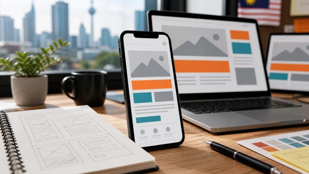
Mobile-first website design means planning the phone experience before the desktop layout. For Malaysian businesses, this matters because many customers discover brands through Google Search, Google Maps, Facebook, Instagram, TikTok, and WhatsApp links on mobile devices.
1. What mobile-first design actually means
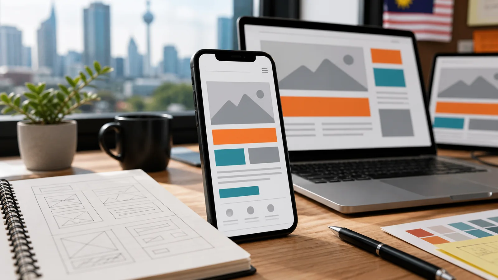
Mobile-first does not mean shrinking a desktop website until it fits on a phone. It means deciding what a mobile visitor needs first: the offer, proof, location, price cues, contact action, and next step. Once the mobile experience is clear, the desktop version can add more space, visuals, and supporting detail.
Responsive design is about adaptation. Mobile-first design is about priority. A responsive site can still feel clumsy if the mobile order, buttons, forms, and speed were not planned properly.
2. Why mobile-first matters for Malaysian businesses
A potential customer may find your business while waiting for food, sitting in a Grab, browsing after office hours, or comparing options inside Google Maps. If your website is slow, cramped, hard to read, or difficult to contact from a phone, that visitor may leave before understanding the offer.
This affects many industries: restaurants, clinics, tuition centres, property agents, contractors, salons, hotels, ecommerce brands, consultants, and B2B service providers. Even when the final buying decision happens later, the first impression often happens on mobile.
3. Mobile-first design and SEO
Google’s mobile-first indexing best practices say mobile pages should contain the same primary content as desktop pages and should be accessible for Google to render. If the mobile version hides important content or loads badly, Google may understand the page differently.
Google also explains that Core Web Vitals measure real-world user experience for loading performance, interactivity, and visual stability. Good scores do not guarantee top rankings, but fast and stable pages help users, especially on mobile networks.
Important SEO point
Do not remove important content from mobile just to make the page shorter. Use better layout, accordions, headings, and spacing instead.
4. Mobile UX essentials
A mobile-first business website should help visitors understand and act quickly. The first screen should explain what you do and show the next step. Buttons should be large enough to tap. Forms should be short. Images should be compressed. Menus should be predictable. Contact options should be easy to reach.
| Mobile Element | What Good Looks Like | Why It Matters |
|---|---|---|
| Headline | Clear offer in plain language | Visitors know if the page fits their need |
| CTA | WhatsApp, call, quote, booking, or shop button | Reduces friction after interest is created |
| Images | Compressed and relevant | Improves speed and trust |
| Forms | Short, labelled, easy to complete | More enquiries from mobile users |
| Navigation | Simple menu and clear page order | Visitors can compare services without confusion |
5. Common mobile-first mistakes
The most common mistake is designing a beautiful desktop hero first, then discovering that it becomes awkward on phone screens. Other mistakes include tiny text, buttons too close together, hidden pricing cues, oversized image sliders, long forms, weak contrast, and WhatsApp buttons that open with no useful message.
For ecommerce businesses, mobile checkout friction can directly reduce sales. For service businesses, unclear mobile CTAs can reduce enquiries. For local businesses, missing map, hours, and location details can stop customers from visiting.
Mobile-first habits
- Write short sections with helpful headings.
- Put the strongest CTA near decision points.
- Test forms and WhatsApp links on real phones.
Avoid
- Desktop-only sections that collapse badly.
- Heavy animations that slow mobile browsing.
- Hiding key content from mobile users.
6. Mobile-first website checklist
Before launch, test the website the way a real Malaysian customer would use it: search, open, skim, compare, tap WhatsApp, fill the form, check the map, and decide whether to trust the business.
- Headline explains the offer clearly on a phone screen.
- Primary CTA is visible and easy to tap.
- Mobile menu is simple and not overloaded.
- Forms are short and use correct field labels.
- Images are compressed and not visually misleading.
- Content is equivalent on mobile and desktop.
- Page speed and Core Web Vitals are checked before launch.
DigitalBina builds and redesigns websites for Malaysian businesses with mobile-friendly UX, clear service structure, SEO basics, hosting guidance, analytics setup, and handover support. If your current mobile experience feels slow or confusing, start with a website redesign review or request a free website audit.
FAQs about mobile-first website design
Is mobile-first the same as responsive design?
No. Responsive design adapts the layout. Mobile-first design plans the mobile user journey first.
Does mobile-first design help local SEO?
It supports local SEO by improving mobile usability, speed, clarity, and conversion paths for visitors from Search and Maps.
Should I remove content on mobile?
No. Keep important content available. Use better structure, accordions, and spacing instead of deleting useful information.
What is the most important mobile CTA?
It depends on the business. For services, WhatsApp or quote forms often work well. For ecommerce, shop or checkout actions matter most.
Can an old website be made mobile-first?
Sometimes small fixes help, but older sites often need a redesign to properly improve structure, speed, and mobile conversion.